Reimagining local consumption
OVERVIEW
4 months to build a business from scratch
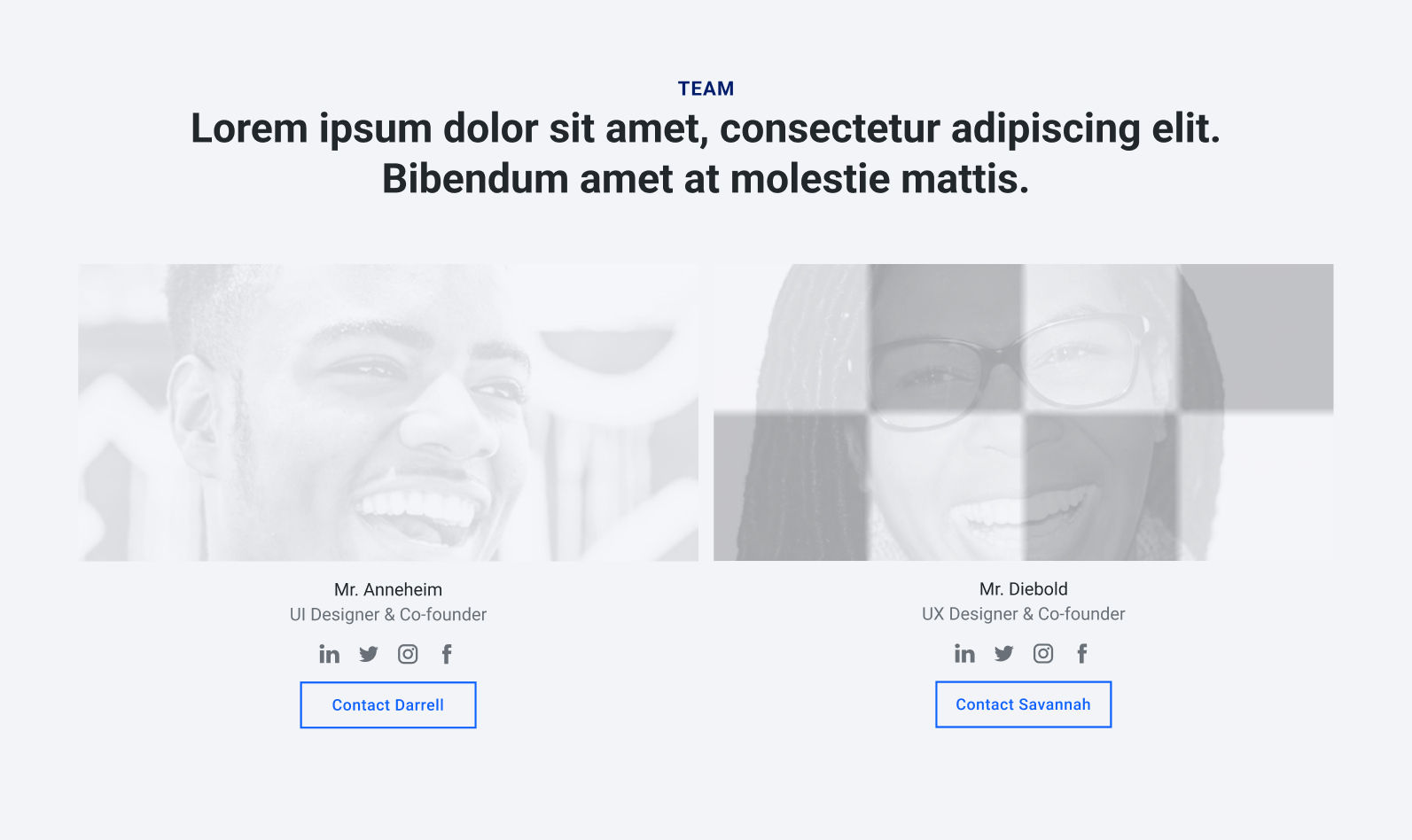
As part of our Master's degree project, H. Anneheim and I were tasked to imagine a whole business, from branding and business plan to web and mobile screens. On top of that, we created a light and dark mode, as well as a dynamic brand identity. Yes, dynamic.
PROBLEM(S)
The cost of convenience
Convenience has reshaped how we buy: faster, cheaper, and more often. But this comes at a cost; overconsumption hides the people and logistics behind items, and mass production is often favored over local manufacturing. Plus, it's difficult for consumers to find local makers, and vice versa.
PROCESS
How we broke a mountain of work into manageable tasks
Starting a business from scratch is daunting, especially when the scope spans research, strategy, branding, and product design. But there's always a way to simplify the next tiny step.
1. Starting from issues we care about
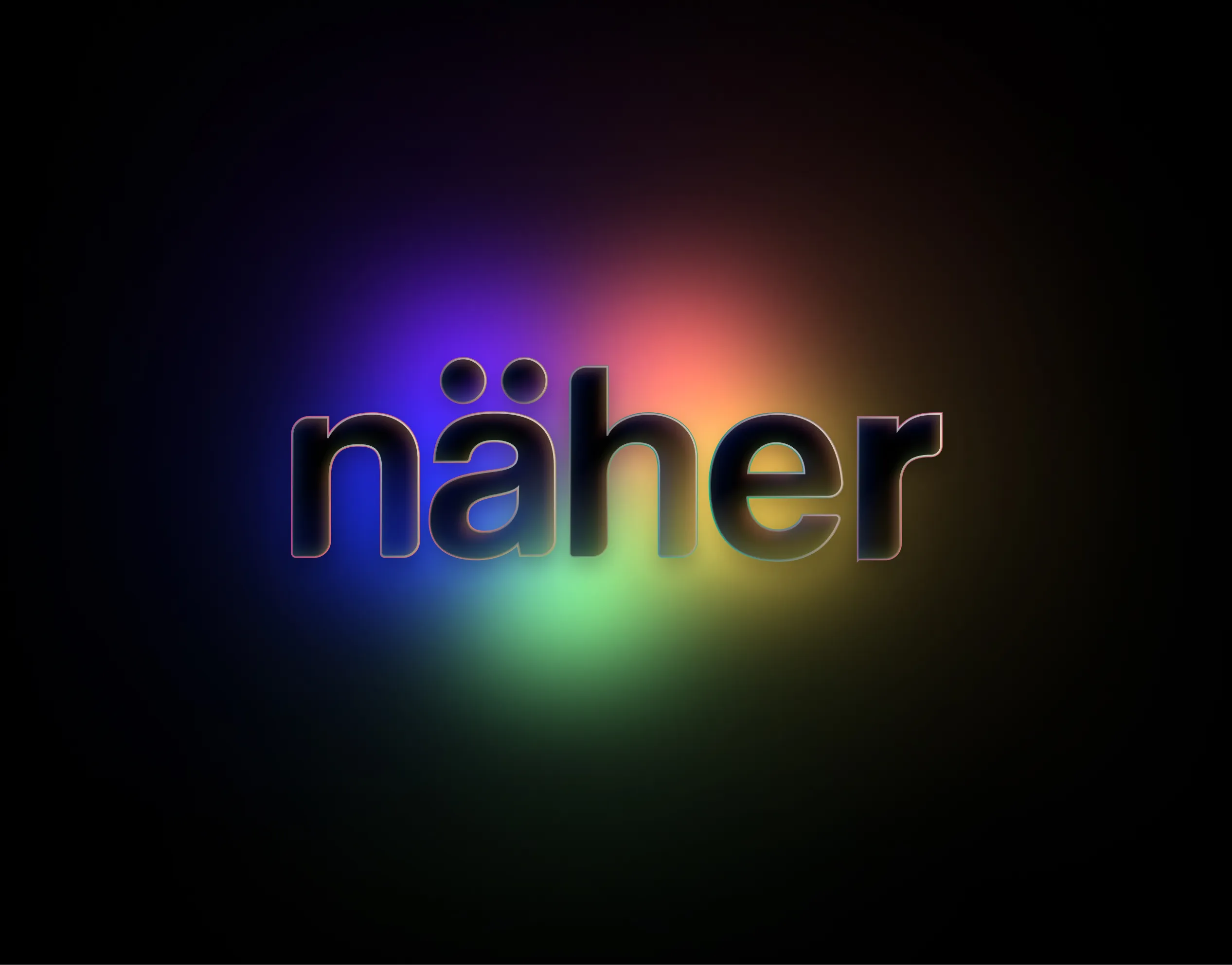
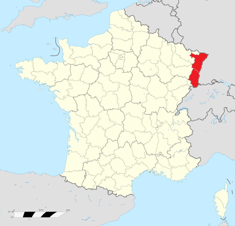
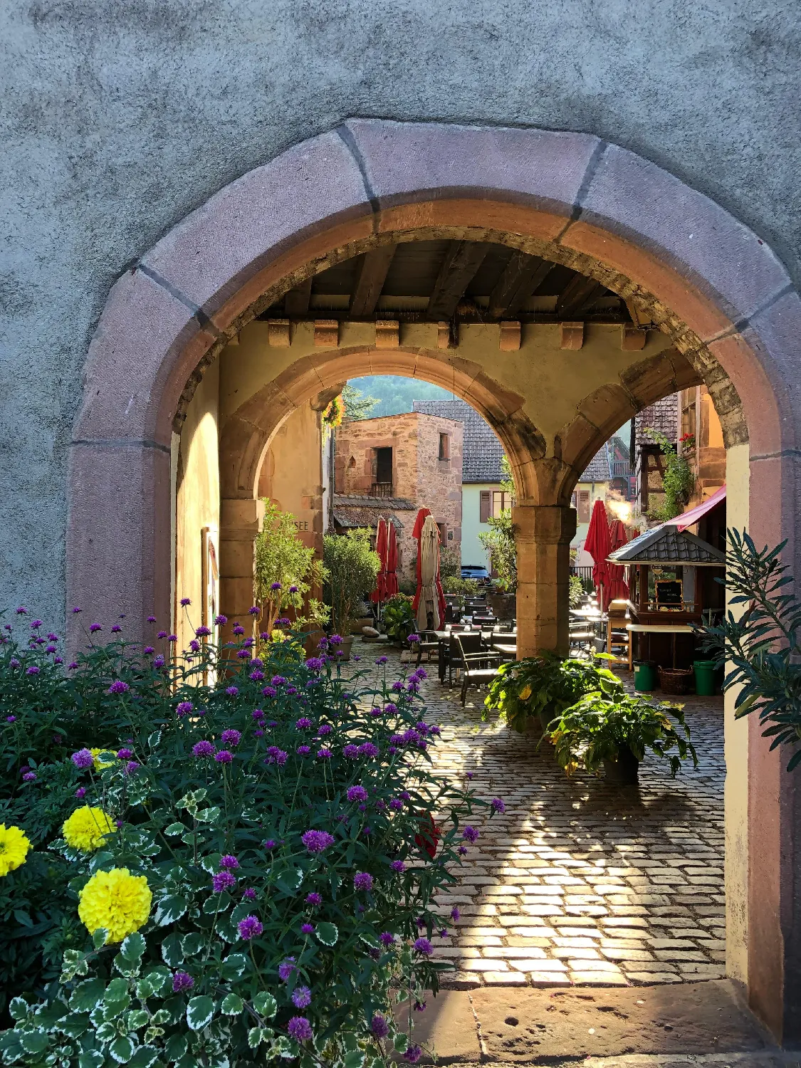
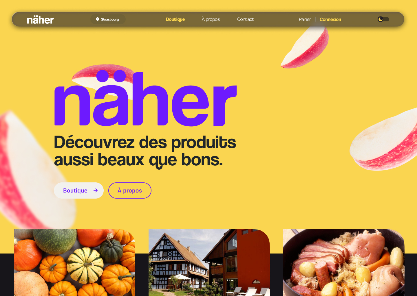
We began with problems we personally felt: overconsumption and the lack of visibility for local producers. näher, a German word meaning "closer" felt particularly fitting to our region, Alsace, in the East of France, where we'd always imagined starting the business.
2. But first, let me ask the users
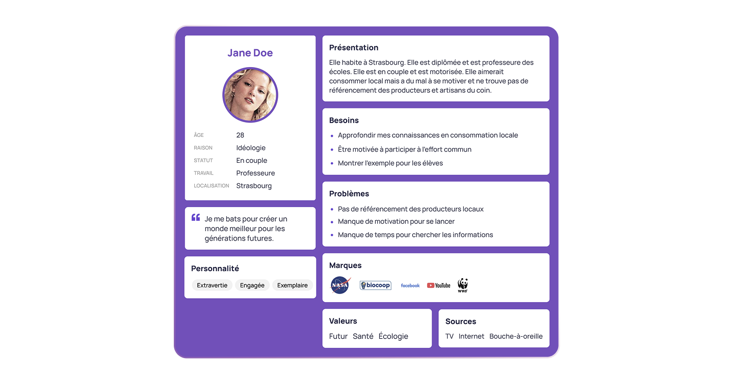
To make sure we were building in the right direction, we started by interviewing potential users in Strasbourg's local markets. Not only did this confirm the issues we detected, but it also revealed a strong interest in a digital platform that would make local consumption easier and more visible.
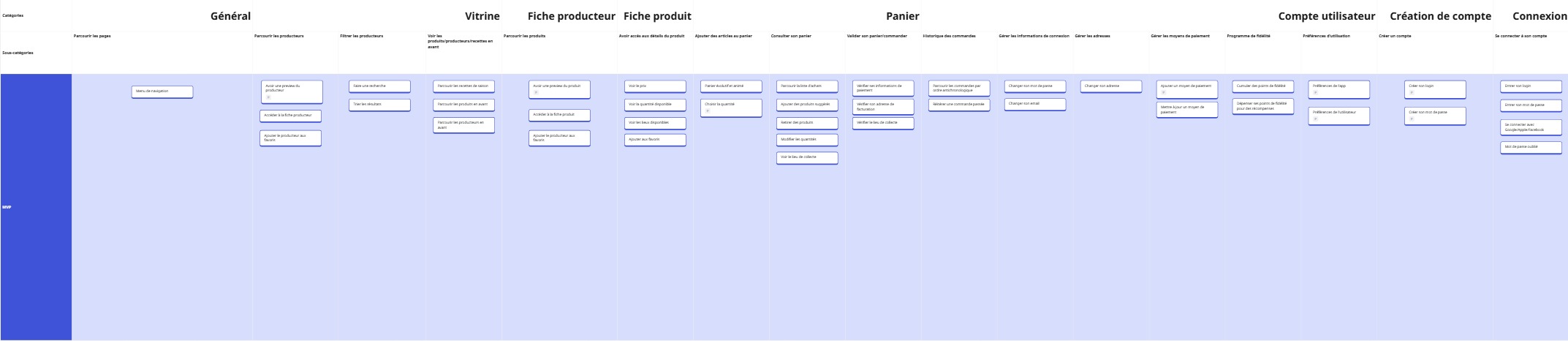
3. Listing the requirements
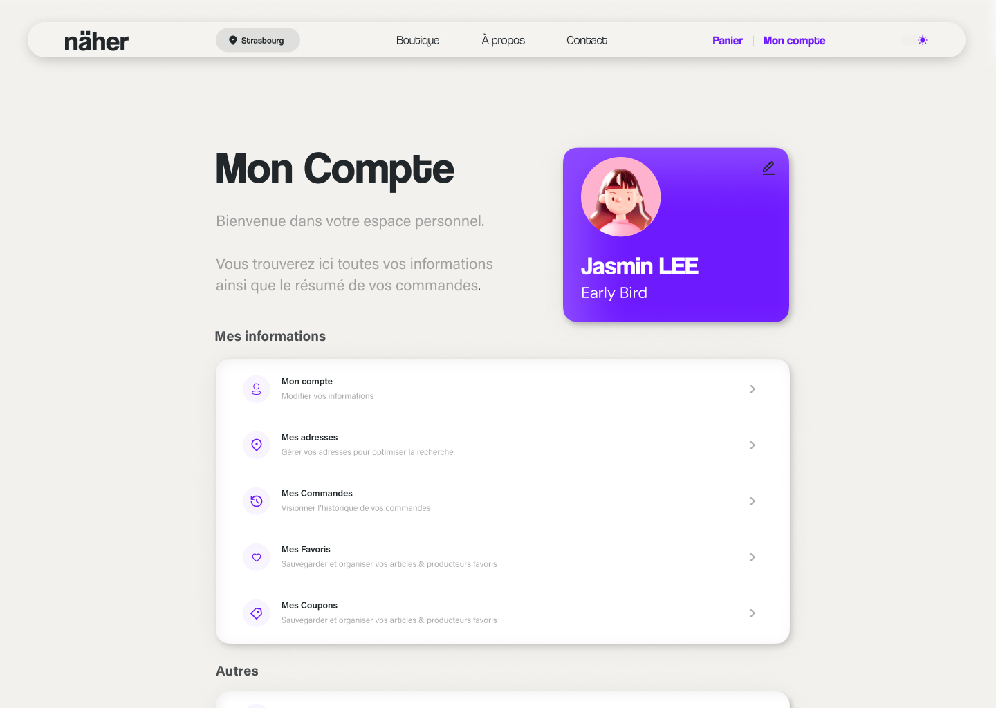
After summarizing the insights, it was time to list all the must-have and the nice-to-have. We wrote down all of the pages we could think of, both in producer and consumer view (because yes, we'd need both interfaces). Later down the line, we realized we hadn't gone into enough depth for the sales funnel.
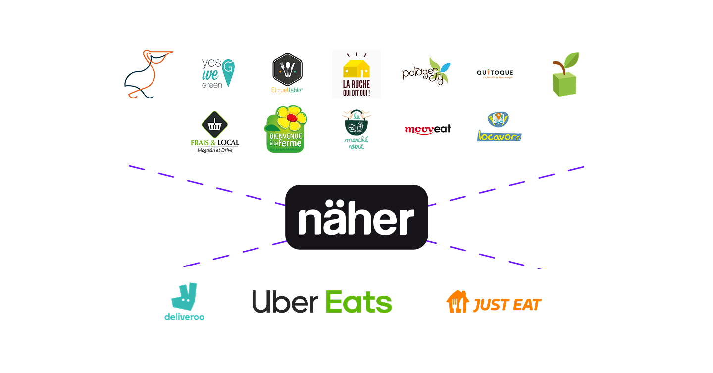
4. Establishing a sustainable business model
Since näher offers online but local consumption (or, facilitation), it places itself in a very strategic spot of the market, between delivery services and local initiatives. Its business model is very similar to that of platforms such as UberEats, taking commissions on orders, and offering sponsored highlights to producers.
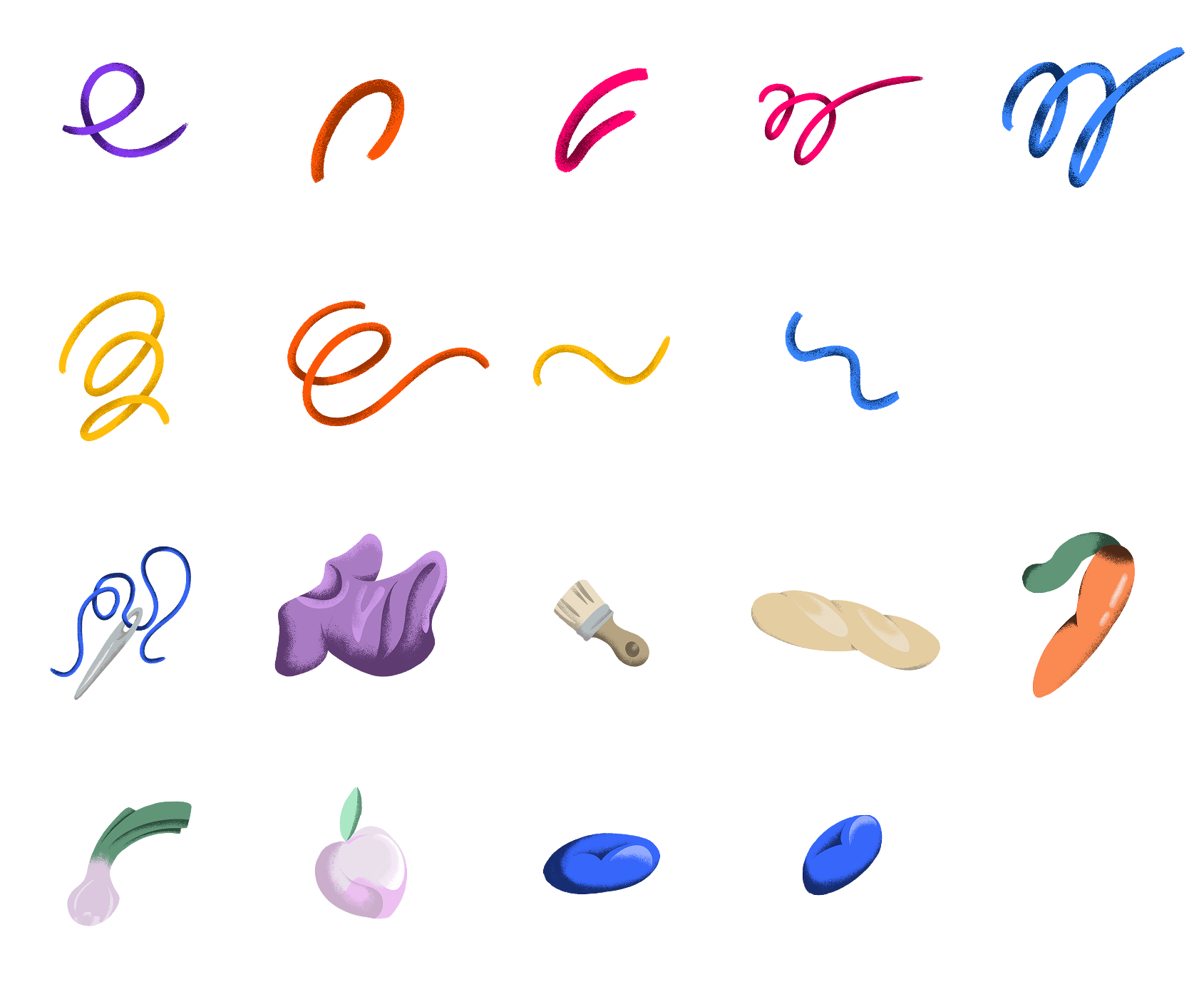
5. Building a shifting visual identity
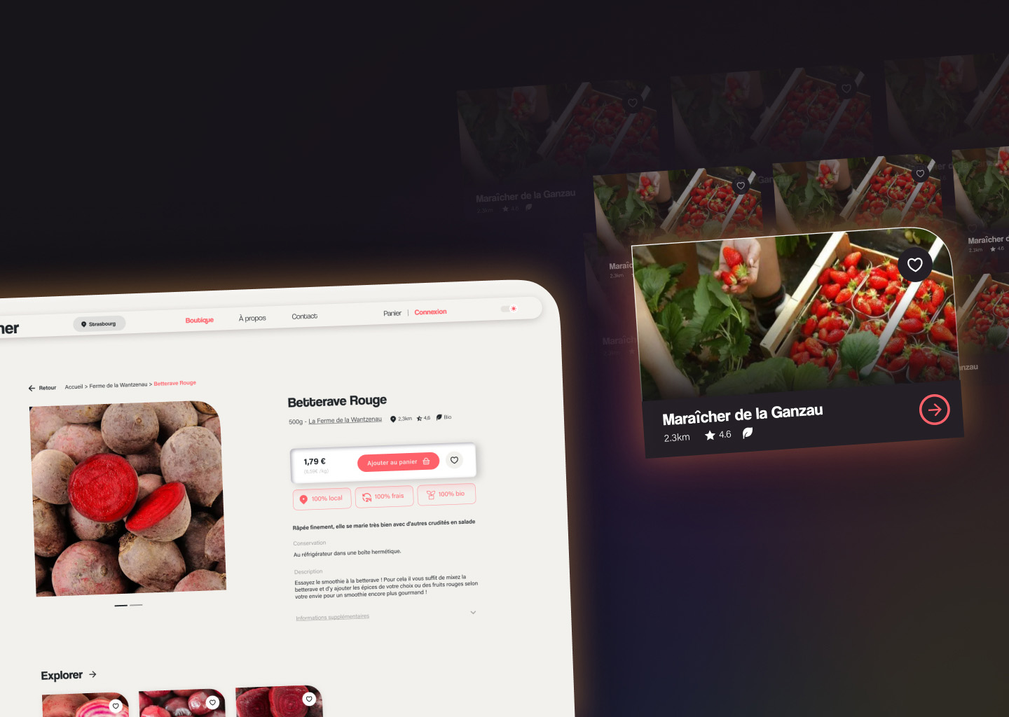
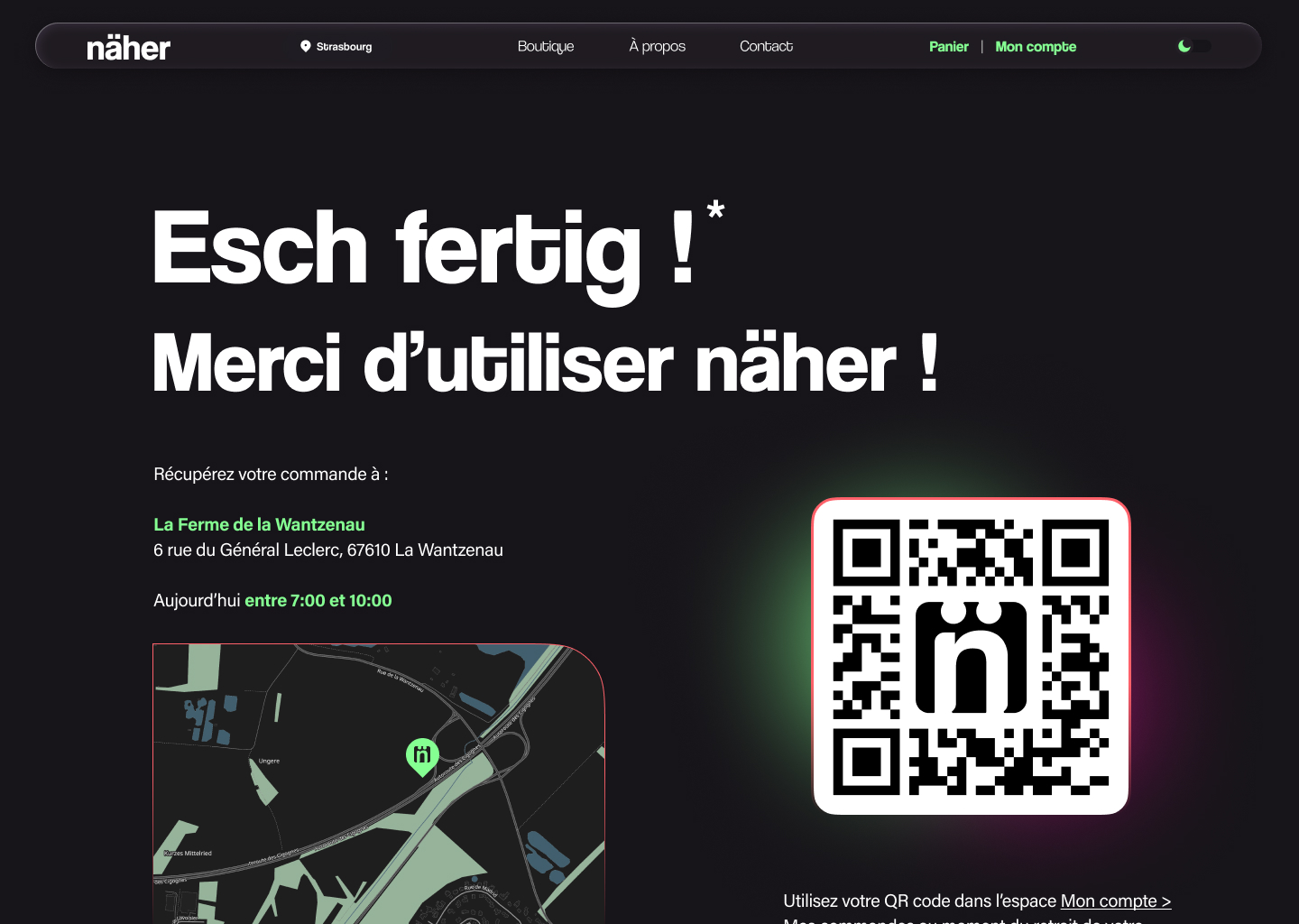
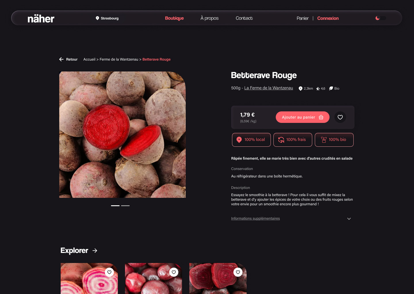
One of the main reasons other local initiatives failed was how outdated their online presence felt. To counterbalance that and to freshen up the image of responsible consumerism, näher takes a stand with a playful identity. We included hand-drawn elements to introduce warmth and whimsiness, and the colors of the brand shift based on the season, to encourage cyclical consumption and create a living identity.
6. Structuring the experience
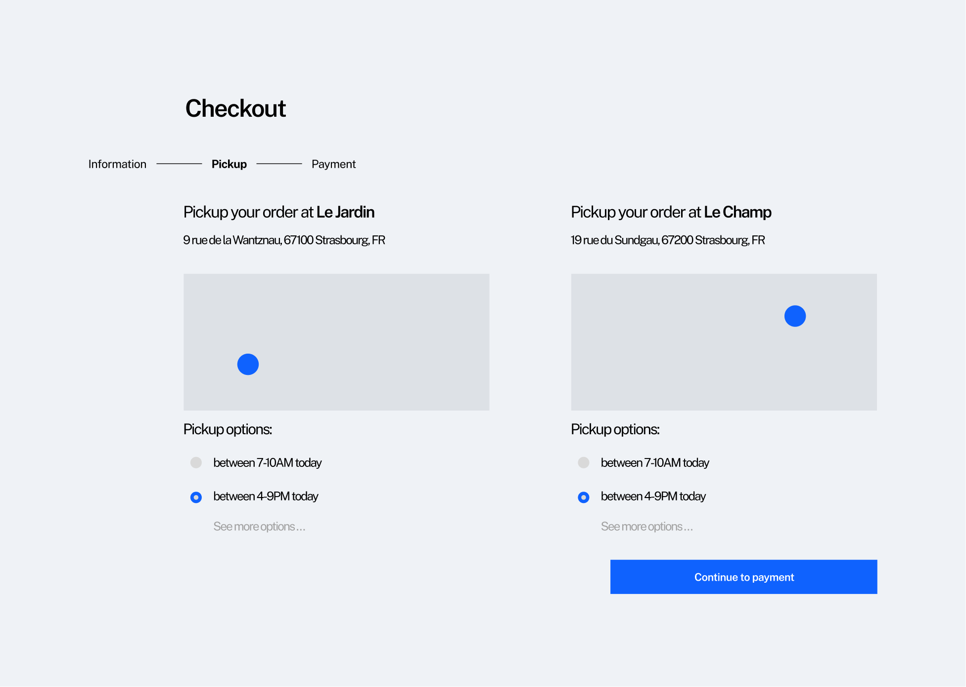
Before diving into the fun part, we had to lay out solid foundations. We covered every page, from the simplest like the product page to the most obscure ones such as pick-up instructions.
7. Designing for familiarity
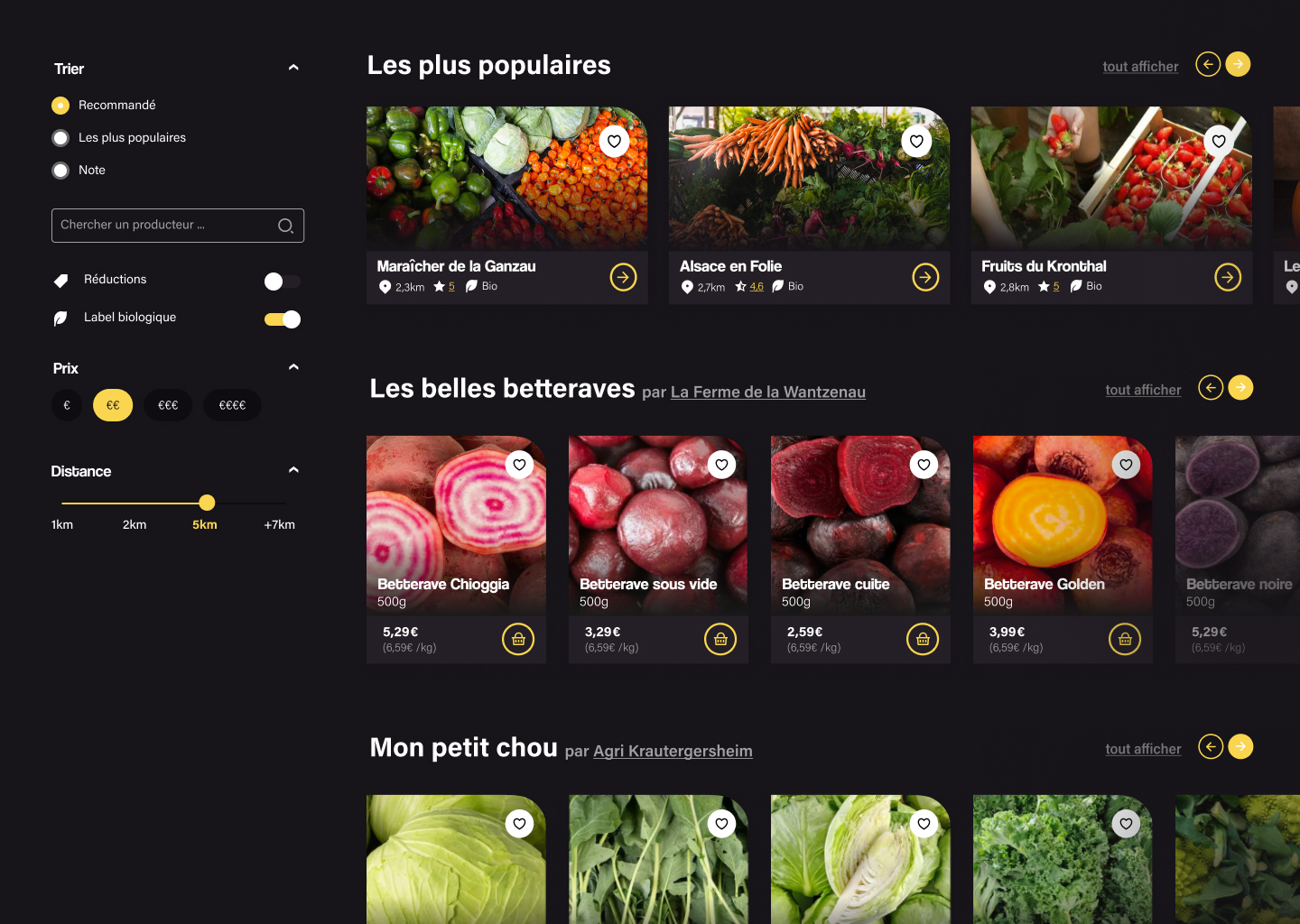
The final design is made of rounded shapes, bouncy animations, and a friendly tone. Light or dark, seasonally colored, it imitates nature in its own way. From the hover states to the shape of the cards, the whole interface is filled with playful motion and color, to keep the experience delightful.
SOLUTION
The local revolution
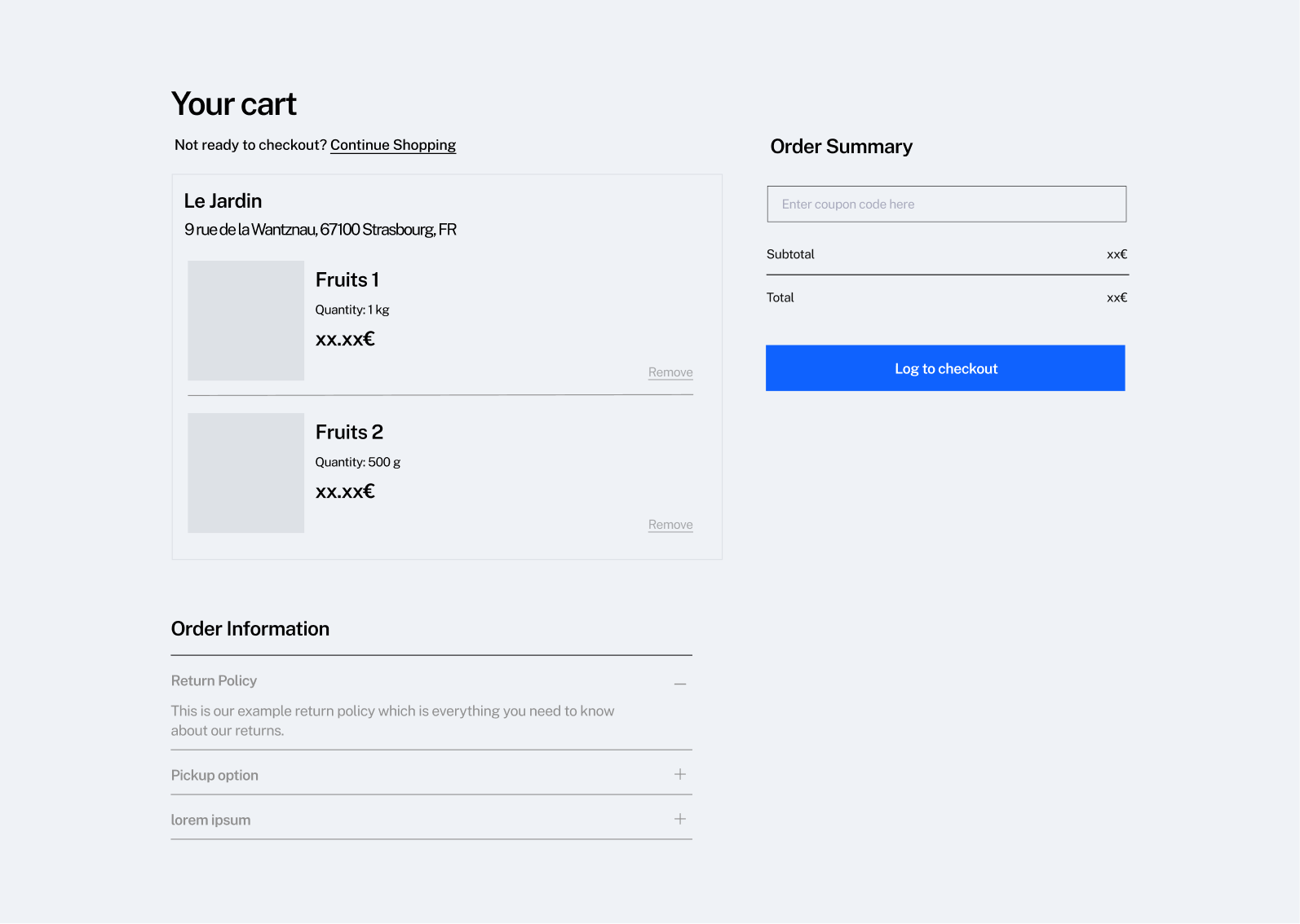
näher is an e-commerce platform focused on local consumption. It allows producers and clients to easily get in touch, and brings us all back to our roots. Simply put, it offers online ordering of local products that users can then pick up directly on site, or in a local market on select days.
RESULTS
A seed awaiting to sprout
The näher project became the highest-rated project in the master's program, and we were strongly encouraged to develop it further. Although it was "simply" a school project, we learned more in a couple months than we would have in an entire year due to how intense this was.

TAKEAWAYS
What I learned
On equal footing
As designers, we are responsible for making our products accessible by everyone.
Do what users want
This time, our assumptions aligned with user opinions. But it won't always be the case.
After all... it's a business
Designing while keeping the end goal in mind taught us how a real company works.